Data visualization is a collage of choice — there are charts, graphs, plots, tables, boxes, maps, and more besides. So, how do you know which visualization technique is right for your data? What will show off your data to tell the best story? Should you use a varied combination of chart types or just stick to well-executed lines and bars?
Data visualization is an art that requires a balance of form and function. Choosing the right style, colors, and design to communicate the right insights, highlight the key areas, and help your viewers come to a logical conclusion based on facts from the data is no simple task.
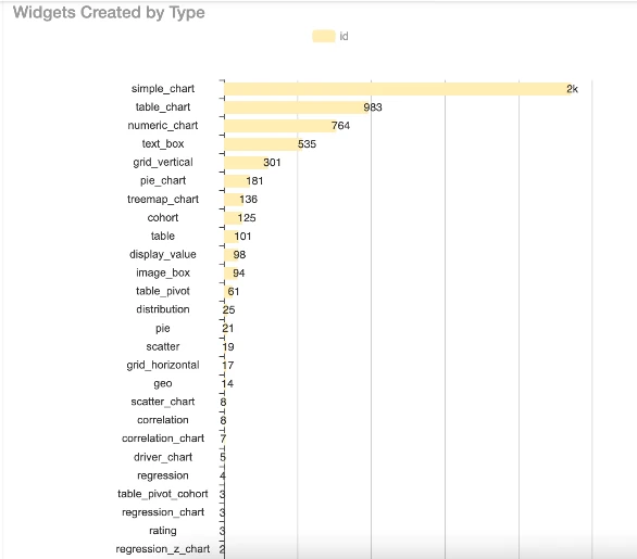
We found that the four most common chart types — bar charts, line charts, tables, and number boxes — account for around 90% of an organization’s charts. These graphics are common for a number of reasons: they show the trends and outliers distinctly, they’re familiar to most people and so require less interpretation, they allow for easy comparisons, and they clearly show relationships between variables.
But some alternatives might showcase your data more appropriately. For example, if you’re trying to show common behaviors between customers who all purchased your product on a certain day, week, or month, a cohort table would work more effectively. Alternatively, if you’re looking at data over a specific area, such as traffic movements within a region, then geo-mapping would be more suitable.
Selecting the right visualization technique for your data can be a task within itself — that’s why we’re here to help. Below, we have explored the 10 most frequently used visualization graphics, plus how and when to use them.
10 types of data visualization charts
Bar charts
Definition and uses: Bar charts are best used for categorical data where you need to show information about items that are distinct from one another. They show discrete rather than continuous data. For example, if your organization sells several products, then your company’s global overview dashboard will likely have a bar chart with total sales split by product over a specific time frame.
Related charts: Bar charts can be further divided using clustered and stacked bar charts. Clustered charts allow you to compare two different category variables instead of just one. So, for example, if you had two houses and needed budgets for each, you could plot them on the same x-axis with a grouped bar chart, using different colors to represent each house.
Stacked bar charts work similarly, but the subcategories are stacked onto a single bar rather than multiple bars. This technique works well when you need to show the total number of something and compare it, such as several products within the same department versus another department.
Although histograms look similar to bar charts, the major difference is the data: histograms plot continuous data, and bar charts plot categorical data.
Source: Apache ECharts
Source: Apache ECharts
Best practice:
- Bar charts can be vertical or horizontal, but if you have many categories, horizontal bars are most appropriate. Vertical bars tend to work better with fewer categories because they fill the space more effectively.
- Categories should be in ascending or descending order.
- Items can be placed into subcategories with separation lines.
- Discrete data can only take certain values, e.g., shoes, socks, integers (1,2,3,4).
- Continuous data can take any value within a range (e.g., height, time).
Line charts
Definition and uses: Line charts plot points that are then connected by a line to demonstrate changes in value. Primarily used for data such as cost trends and sales volumes, line charts show progression over a specific time period. Line graphs are best for continuous data, while bar charts are best for discrete data.
Related charts: You could use a histogram to demonstrate frequency distribution, but histograms don’t allow for easy comparisons of datasets. Line graphs, on the other hand, are especially good at showing more than one dataset for easy contrast. For example, they are a good choice if you want to show the sales trends of two different products or highlight how the value of something has changed (like currency fluctuations). Line graphs highlight anomalies and are easy for stakeholders to read efficiently.
Source: World Bank Open Data
Line graphs are often used in combination with bar charts to create a visual variety that helps stakeholders easily identify which data series is which. For example, below is a typical climate graph showing temperature and rainfall over 12 months.
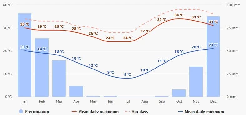
Source: Wikipedia
Best practice:
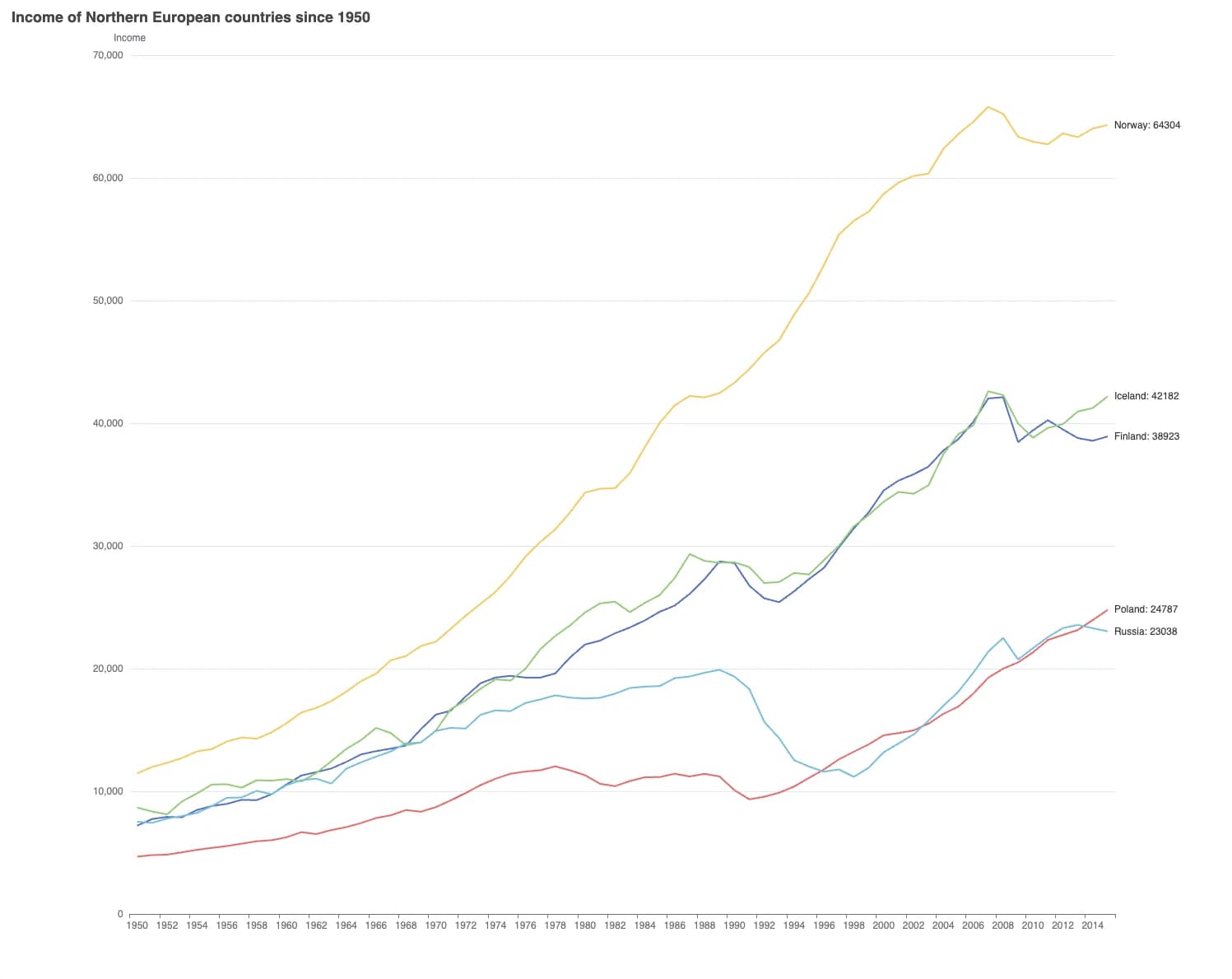
- Use more than one line to show different datasets, but don’t use too many. Otherwise, the data becomes crowded and difficult to read. Seven lines are plenty, as this chart of GDP per capita comparing many countries over time from the world bank demonstrates.
- Don’t be tempted to connect all the data points with a smooth curved line. While this looks better aesthetically, it distorts the analysis. The point of a line graph is to demonstrate the change in value at steep or flat rates. A smooth, curved line may imply incorrect additional data points.
- While line graphs are not required to have a zero baseline, including one is still considered good practice. However, if the relationship to zero is not meaningful, then the baseline should start at the first logical number — measuring temperatures in Fahrenheit would be one example.
Area Charts
Definition and uses: An area chart is a hybrid of a line graph and a bar chart. Like a line chart, area charts should be used for continuous data, and points are plotted and connected with a line. The area below the line is shaded, giving them some of the strengths of a bar chart, particularly for drawing attention to relationships between lines in stacked charts.
For example, when measuring the progression of COVID-19 over time by region, the stacked chart below clearly shows how India is “raising the wave”. However, if the lines were not highlighted, it would be unclear whether each line was affected by the line underneath it or if it was fully independent.
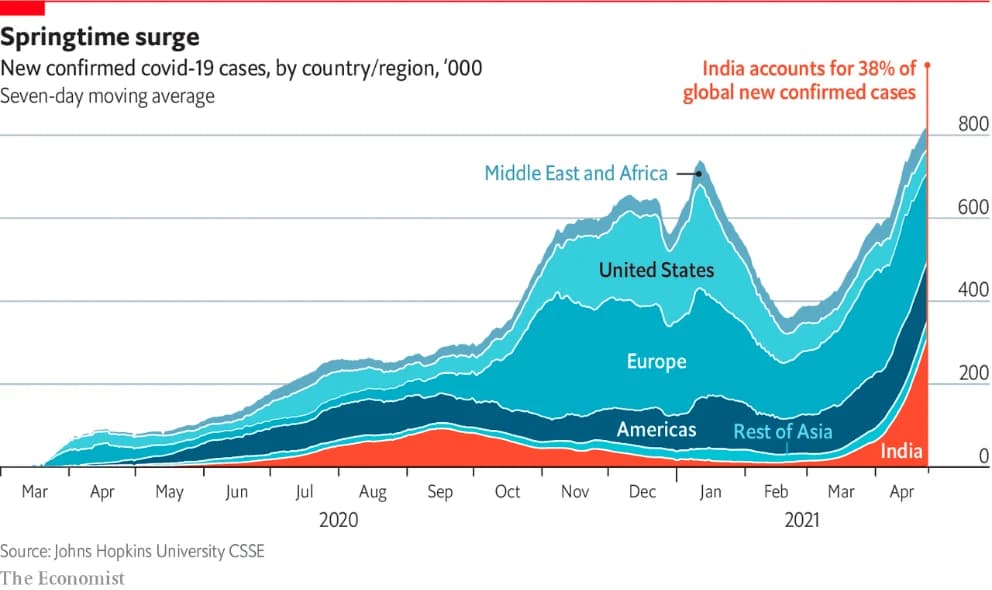
Source: The Economist
Related charts: Bar charts or line graphs can work better than an area chart in some instances. Area charts can be challenging to read and should only be used in specific circumstances, such as when data is expressed as a total, when there are time periods to compare, or when you need to demonstrate trends rather than individual data points.
In the example below, an area chart wouldn’t be suitable. This is because there are multiple categories that you need to compare, and stacking them would obscure the other lines the viewer is trying to see. A line graph would be more appropriate in this scenario.
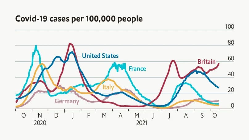
Source: The Economist
Best practice:
- Make sure you have the right data for an area chart. For an area chart to be the best option, you need several datasets across several different time periods showing significant variations and change over time.
- Turn off automatic labeling and add your own labels inside each area to ensure clarity.
- Consider putting the largest or most stable group at the bottom, with the most variable or smallest groups last and on top. This will make the chart easier to read for your stakeholders.
Number box
Definition and uses: This isn’t strictly a visualization technique, but nevertheless, number boxes have power on a dashboard. They show a headline value over a specific time frame, such as sales over the last 30 days. This headline value can be easily compared to a previous relevant value for the same length of time, such as the preceding 30 days’ sales or the same period the year before.
Related charts: Number boxes are ideal for showcasing headline KPIs in dashboards, such as sales or growth, to help viewers understand at a glance how a business is performing. However, they are best used combined with other chart types, such as bar charts or scatter plots. These give more in-depth insights and help the viewer draw conclusions.
Best practice:
- Number boxes are simply headline news and are difficult to draw accurate insights from. Pair with other charts to ensure your stakeholders can gain the analysis and insights they require.
- Title and label as succinctly as possible — number boxes shouldn’t need lots of explanations around them.
Scatter plots
Definition and uses: Scatter plots or scatter graphs show two variables represented by dots plotted along two axes. They are best used to demonstrate the relationships between variables and highlight patterns or relationships within your data.
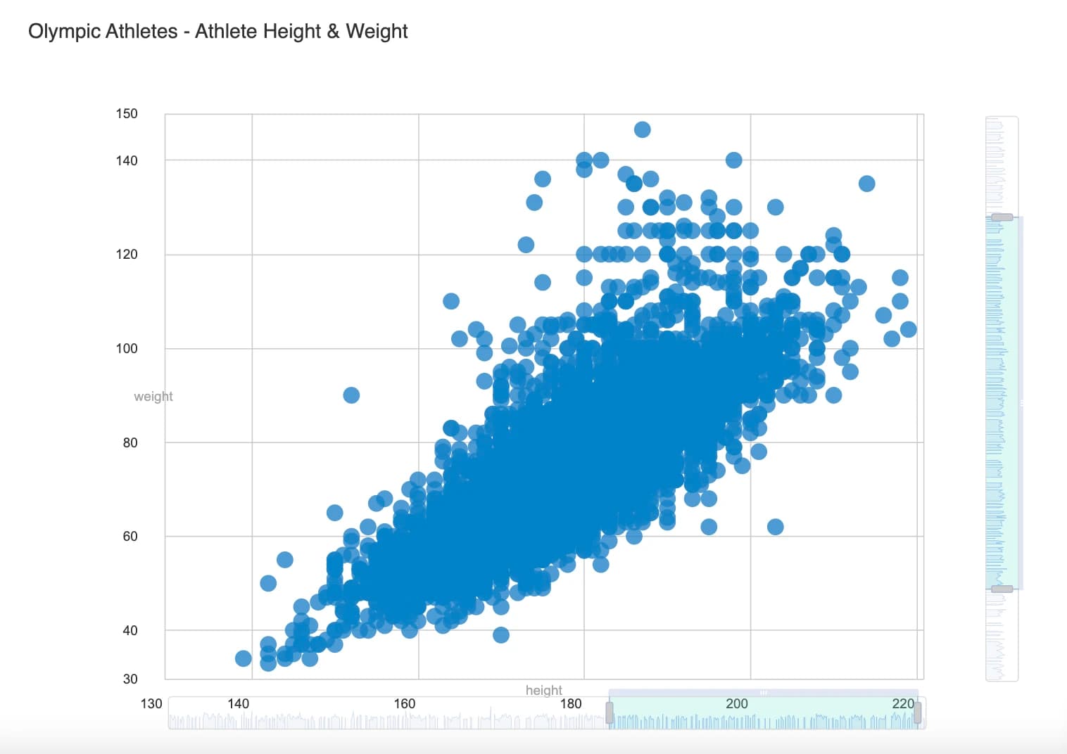
The data for a scatter plot must be related to show a correlation. For example, you could plot the number of hours studied alongside test results, or wellington boots sales alongside daily temperature values. Data points can be divided into groups depending on how closely a set of dots are clustered together. A lack of dots within a certain area can also show you there’s a gap in the data. The closer your dots are to each other, the stronger the trend or relationship.
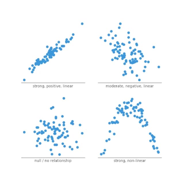
The relationship between variables can take different shapes and be identified as positive or negative, strong or weak, linear or nonlinear. Identifying these relationships and their statistical significance is a separate topic worthy of a longer discussion.
Source: Chartio
Related charts: Straightforward scatter plots can be used to demonstrate the relationship/patterns between the data points more clearly by adding a trend line. A third variable can also be added for more sophisticated data analysis, using color or bubble size to differentiate and allow for deeper comparisons.
Best practice:
- Correlation doesn’t mean causation. When interpreting your scatter graphs, your stakeholders mustn’t assume that changes in one variable are responsible for changes in another.
- Don’t over plot. If there are too many data points, your scatter graphic will become a blob rather than a graph. At the very least, reduce the size of the marks used as the dataset gets larger.
Pie chart
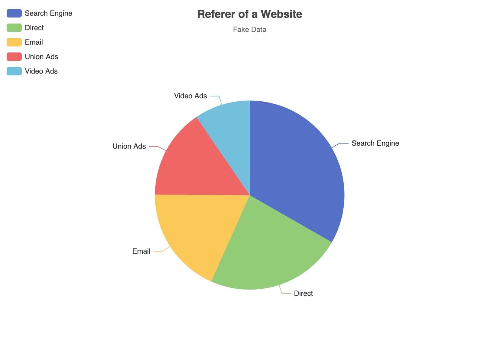
Definition and uses: Pie charts are common graphs because they are familiar and simple to understand and create. A pie chart is a circular graph that compares parts of a whole by dividing the circle into proportionate slices. For example, they are used to compare categories, such as voters in a specific area or regional demographics.
Pie charts require a very specific set of data and are very basic, so they should only be used when you have a total amount of something and a dataset that divides this amount into parts. When added together, all the slices of the circle must equal a whole (such as 100%).
Related charts: Pie charts are often lamented. Respected data visualization expert, Edward Tufte, said: “Pie charts are bad and the only thing worse than one pie chart is lots of them.” This is because pie charts often don’t tell the full data story and can make it hard for our eyes to distinguish properly between the sections unless they are dramatic or known — half (50%), a third (33%), or a quarter (25%), for example. Good alternatives to pie charts are line graphs or stacked bar charts, depending on the dataset and data story you are trying to tell.
Source: Apache ECharts
Best practice:
- Limit the number of slices. If you have too many categories to compare, the pie chart becomes overly complex and won’t show the full data story. Five to six categories are considered best practice. If you have lots of smaller categories, consider combining them and calling the sector “other”. Also consider the order of the slices, starting with the largest and going round to the smallest.
- Try using a donut-style chart instead of a pie chart. They are seen as more dynamic and less basic.
- Pie charts compare each group or category to the whole. If you are looking to compare categories to one another, use a different type of chart — a scatter or line chart would be more appropriate, for example.
Treemap
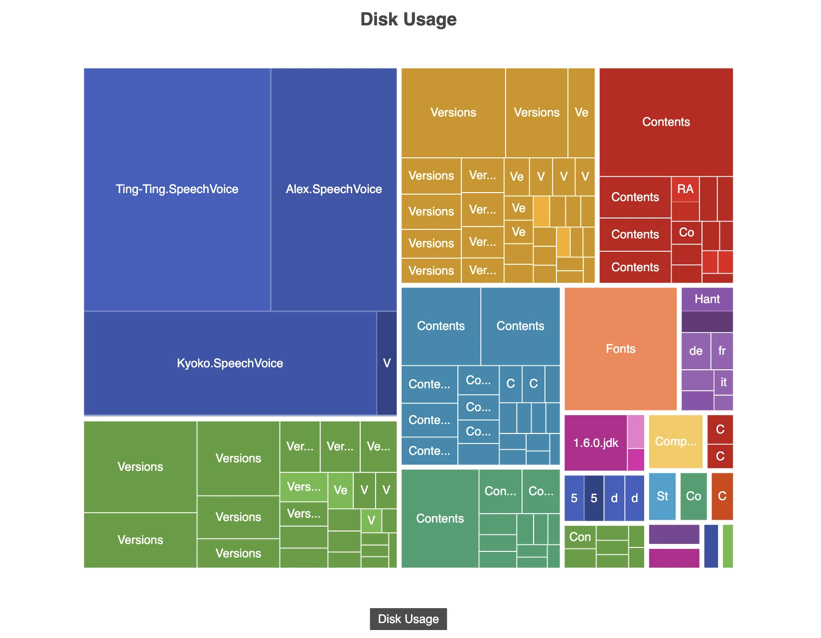
Definition and uses: Treemaps are best used with large datasets that are hierarchically structured. Treemaps consist of nested rectangles that show two distinct types of information: the value of individual data points and the structure of the hierarchy.
Treemaps are often used on data dashboards and can display tens of thousands of data points, making them ideal for sales data because they demonstrate relative category sizes and enable viewers to see the relative contribution of subcategories. For example, a supermarket sales dashboard might contain one big rectangle representing clothing sales (alongside all the other categories, such as bakery, homeware, groceries, etc.) and subcategories that drill down further to school uniforms, shorts, or raincoats, allowing a sales director to see what’s selling well within each category and subcategory.
Dynamic treemaps are perfect for drilling down into data. For example, one of the best-known treemaps is the 2016 interactive US government budget treemap. In this chart, it’s possible to see spending for the main categories (e.g., National Defense), and also for each subcategory (e.g., Military Personnel).
Source: Apache ECharts
Related charts: Treemaps are much more complex than pie charts and, similarly, should only be used when there is one category that adds up to 100%. Treemaps can be very powerful tools, but they take some work and may need interpreting for your stakeholders.
Best practice:
- Treemaps should only be used when there is a large dataset and when some values are linked to each other under a parent category.
- Every rectangle should be clearly labeled with additional information if required. Try to keep it as uncluttered as possible to ensure clarity for your stakeholder.
- Color should be deployed carefully to help distinguish between categories.
Geomap
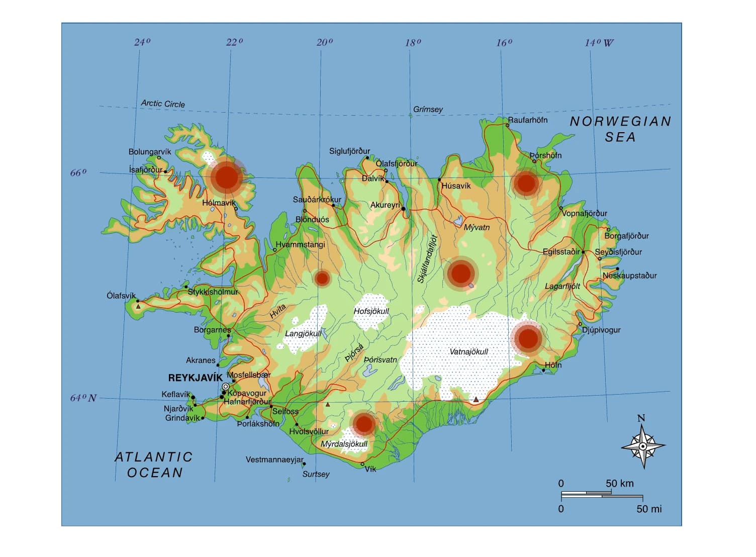
Definition and uses: Geomaps are charts showing countries, continents, or worlds that apply values to those regions. If your data has a geographic element, like traffic flow, flight data, or regional information such as weather, then a geomap would be the most effective way to tell your data story.
Maps are eye-catching and can transmit information very effectively. For example, you might use a regional heat map if you want to demonstrate weather patterns for certain locations so your store knows whether to stock more boots or ice creams.
Related charts: There are many different types of geomaps, from heat maps to statistical maps and point maps to bubble maps. Your map’s sophistication can go as deep as your knowledge — from 2D and 3D to dynamic, fully interactive maps. Whether your data is point data (i.e., it refers to a specific location) or polygon data (i.e., it refers to specific geographical boundaries) will help you decide what kind of geomap will be most suitable.
Source: Apache ECharts
Best practice:
- Try to think about your data story before deciding on which type of geomap works best. Keep your map focused; there’s no point in showing the entire country map when all you need is the southwest region.
- Is location data crucial to your story? Are the office locations central to what your data needs to communicate? If not, consider different charts that may be more suitable, such as line charts or scatter plots.
- The best geomaps have layers — pop-ups or additional hover information that delivers a more in-depth story.
Table
Definition and uses: Tables offer the rawest presentation of data. While they don’t strictly enable data visualization, they are easy and efficient for stakeholders to read and let them quickly understand the data they are interested in. They are best used when precise numbers or specific data is important — for example, Premier League football tables showing who is at the top of the league, the number of games played, and how many games each team has won, lost, or drawn.
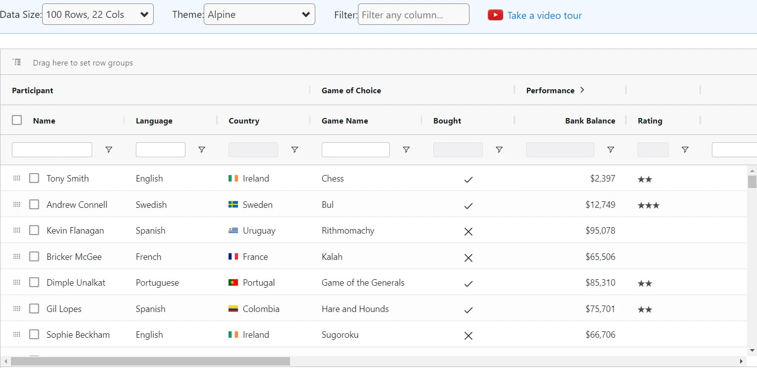
Source: AG Grid
Related charts: Where bar charts and number boxes allow for some comparisons to be made, a table lets you compare more different categories within one chart. What’s more, tables can compare one value to more previous values than a number box, allowing your stakeholder to spot if an outlier is really an outlier quickly and easily.
Best practice:
- Use indentations to demonstrate categories and subcategories. This can help your stakeholder see the most pertinent information first before deciding whether to read more.
- You can further highlight interesting or anomalous data points using color; for sales above X or below Y, for example.
- If you have a range of stakeholders, you could make your table searchable to help each of them locate the specific information they need more quickly.
Cohort tables
Definition and uses: Cohort analysis provides in-depth insights into user behavior as well as business or product performance. A cohort is a group of users or customers who share a similar characteristic, such as all buying a product from your website in June or signing up for your app in December.
By tracking and analyzing these customers’ behaviors according to a certain metric over time, such as whether they log on to the app or use any advanced features every week, cohort analysis can be a powerful tool for boosting customer retention and avoiding churn. By showing customer or user behavior, cohort analysis is also extremely useful for business planning and accurately forecasting future revenue.
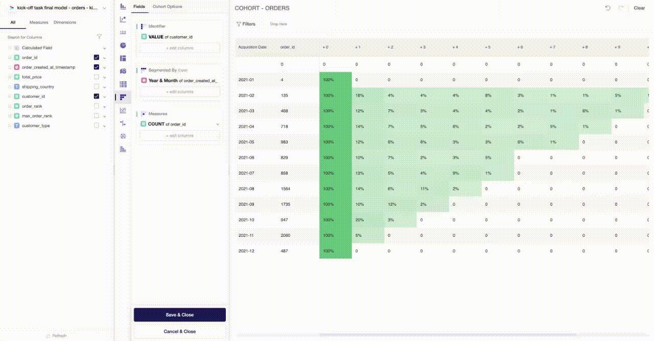
Related charts: Cohort charts stand alone when it comes to a deep dive into customer behavior. As a type of table, they can be challenging for stakeholders to interpret, so are often combined with line charts. By plotting the data from the cohort table into a line graph, it becomes much clearer to understand a customer retention curve which instantly delivers insight into when customers stop purchasing or using your app.
Best practice:
- Use color shading to demonstrate trends. A best practice is to use darker colors the higher the metric (e.g., revenue per customer or time spent on the app).
- Cohort charts can help stakeholders make solid strategic decisions based on your data, so they are worth the challenge despite taking a lot of effort.
- Start small. The more cohort data you have, the better your story will be — but it can get overwhelming quickly. Start with just the data you know is relevant and add more to define your cohort when you feel confident.
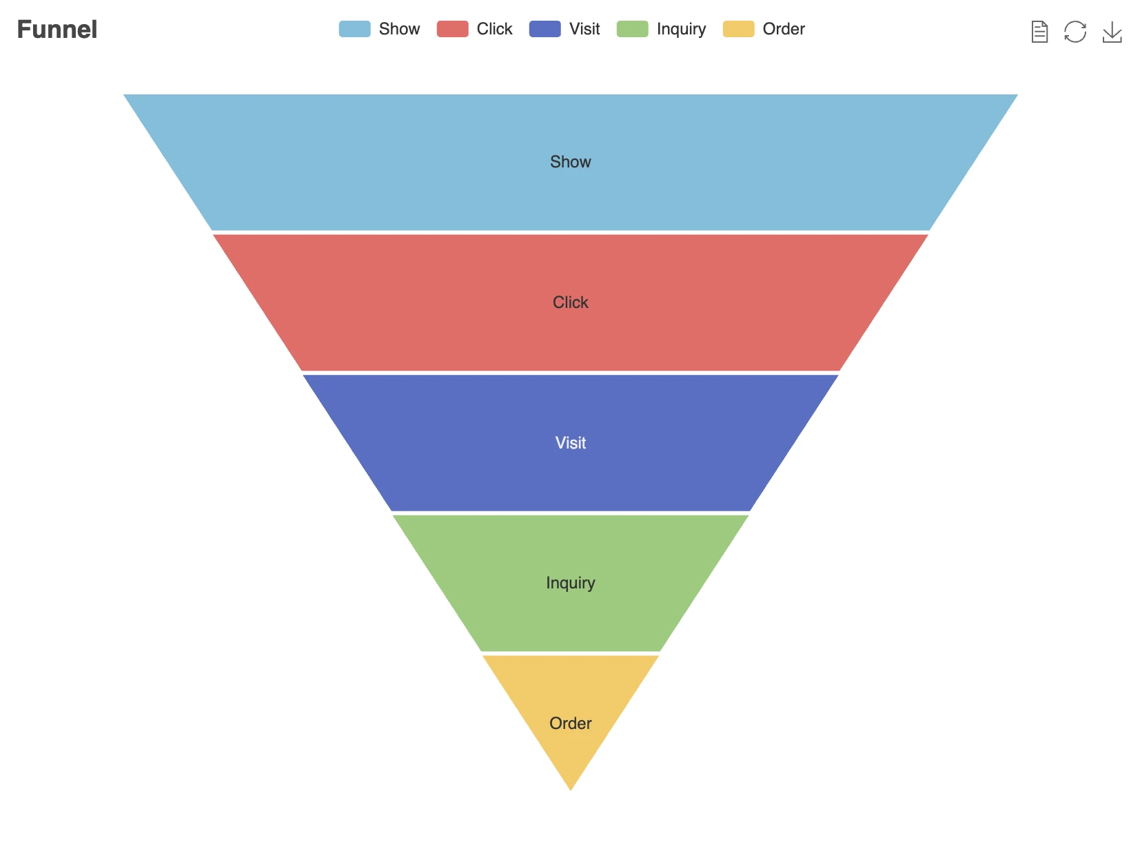
Funnel chart
Definition and uses: Funnel analysis follows individuals (such as users or companies) through a process with multiple steps, showing the number that reaches a specific stage and conversion percentages between stages.
They are best used in business or sales contexts. For example, a marketing and sales funnel chart starts by showing how many users gained awareness of the product following a campaign. It goes on to show how these users evolved to become marketing-qualified leads (MQLs) and then sales-qualified leads (SQLs). It ends with a number or percentage of users who made a purchase. This makes it easy for stakeholders to see exactly when people or companies are dropping out of the process and fix their strategy accordingly.
Related charts: Funnel charts are closely related to bar charts. However, where bar charts are aligned to either the x or y axis, funnel charts are from a center line. Often, bar charts (especially stacked bar charts) can convey information better because readers can see the proportional changes at each stage more easily.
Source: Apache ECharts
Best practice:
- Limit your process to five or six stages. It will become confusing if there are any more than this.
- Funnel charts can only tell you when a user or customer drops from the process; they can’t tell you why, as this requires further analysis.
- Use bars of different sizes to reflect numerical proportions. For example, if you have 1,000 customers on stage one and 500 on stage two, make the second bar half the length.
- Use different colors to help readers easily distinguish between the bars.
Conclusion
At Y42, we understand it can be challenging to choose the right data visualization technique. Here, we’ve aimed to help you navigate through the minefield and discover the technique that tells your data story succinctly, with clarity and creativity.
This is by no means an exhaustive list, so please do contact us to chat further about data charts and how they can enable you to visually communicate your data insights.
Category
In this article
Share this article