
Facing customer churn is difficult for every organization. It’s especially difficult for customer success and product teams when the situation endures and every churn prevention call is like dancing on razor blades. Low retention can be just as painful. For example, when you suspect that buyers of a specific product through your online store would be willing to re-purchase more often, but you don’t have enough data to validate that.
The best way to help untie this knot of churn and retention is to use cohort analysis. By giving you key insights into your customers’ behavior, cohort analytics enables you to identify trends and patterns and understand how these behaviors impact your company.
Cohort analysis provides in-depth insights into customer and user behavior, as well as business or product performance. It’s one of the most powerful tools for boosting customer retention and engagement. According to HBR, it costs five times more to acquire a new customer than it does to retain an existing one.
Plus, conducting this analysis means you won’t need to spend hours in Excel working on the formula adjustments and data manipulation, leaving you more time to help your stakeholders devise retention or growth activities instead.
What is cohort analysis?
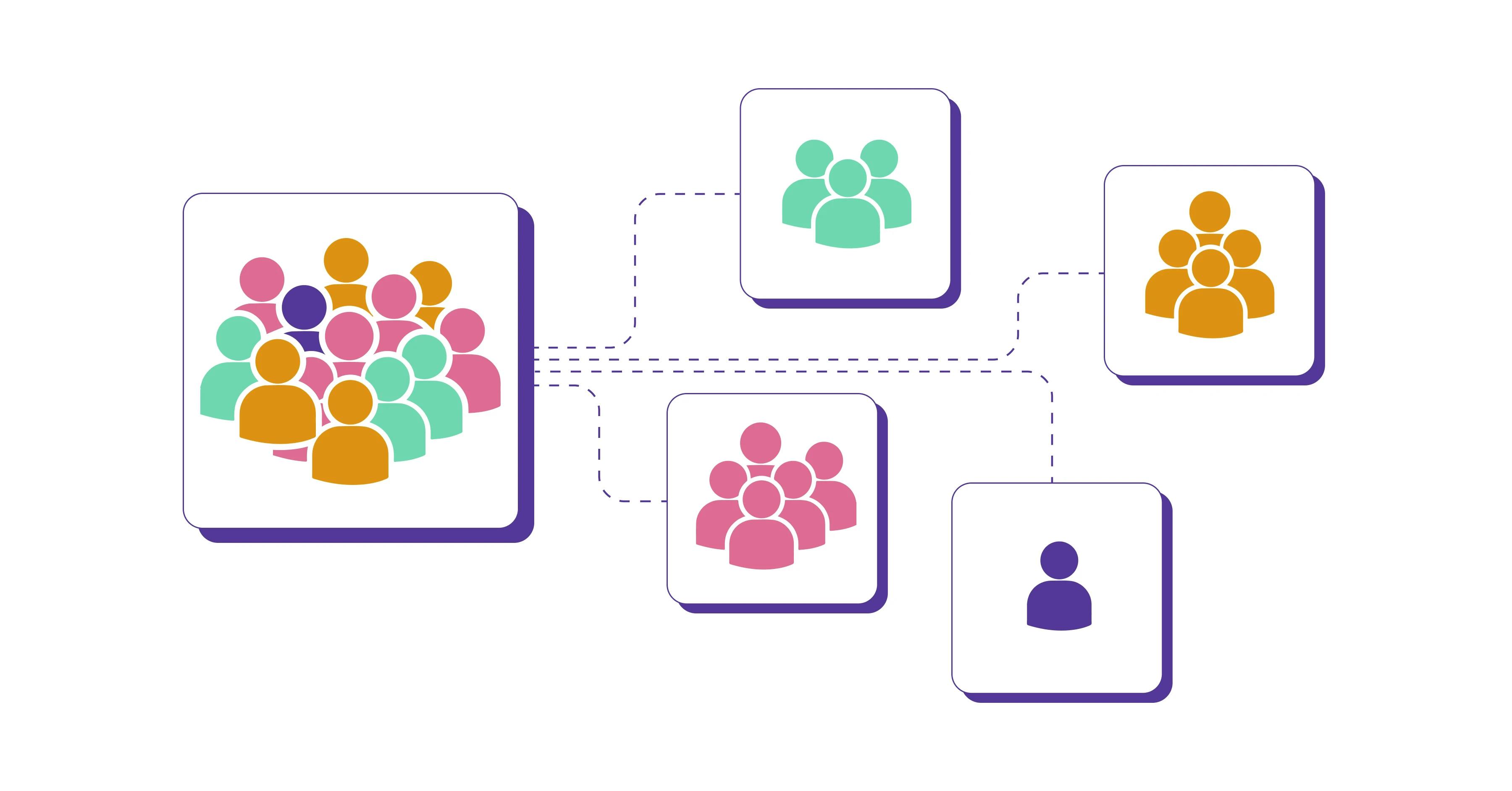
A cohort is a group of users or customers that share the same characteristics, experiences, or behaviors within a set timeframe. For example, users who signed up for your app in June 2022 or activated certain product features within a week of download can be segmented into cohorts.
Cohort analysis is a subset of behavioral analytics that breaks down customers into those different groups, enabling you to analyze user behavior and experience and better understand how your customers interact with your product or service over their lifecycle.
Types of cohorts
There are two common cohort types:
- Acquisition cohorts
- Behavioral cohorts
Acquisition cohorts
In acquisition cohorts, groups are divided based on when they signed up for your product or placed their first order. These types of cohorts are used to determine the who and when.
For example, if we look at a SaaS cohort analysis, your marketing team might want to determine the retention rate of users following two different marketing campaigns for your app. The characteristics of the cohort in this scenario would be defined by the campaign attributed to the new customer, with the date of the first log-in or download and current customer status data also included from both campaigns.
This cohort analysis would demonstrate to stakeholders which campaign had the highest customer retention rate. They can then adjust their tactics and strategy, putting more budget into the campaign that yields the best results.
Behavioral cohorts
In behavioral cohorts, groups are divided based on their behaviors and actions within your product, helping you to understand the why. For example, you might want to track all customers who purchased your app between a certain date and then logged on for more than three days within a given period. These “power users” can then be nudged to download advanced features or make further in-app purchases.
Conversely, you can also understand where and when new users are becoming inactive, which means your product development teams can see where they need to adjust your product or service to avoid the drop-off.
Without cohort analysis, these development and retention strategies wouldn’t be possible. Given these outcomes, it’s easy to see why cohort analysis is one of the most popular use cases that our customers perform.
How to perform cohort analysis with Y42
So far, we’ve outlined what cohort analysis is, the different types, and why conducting this analysis is important. Now the question is, what does performing a cohort analysis look like in practice?
To perform this sort of analysis, you first need to have the right analytics tool in place. The Y42 platform has a dedicated cohort table widget that you can use to conduct your analysis. It’s quick and easy to use and delivers powerful results that will help your stakeholders understand your customers’ behavior. Below is a step-by-step guide that walks you through building a cohort chart using Y42.
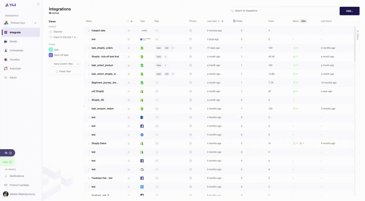
Connect your data sources
Your first step is to integrate your data sources containing the relevant information. You can easily connect to one of the 100+ data sources available, such as Hubspot, Amplitude, Mixpanel, or Shopify.
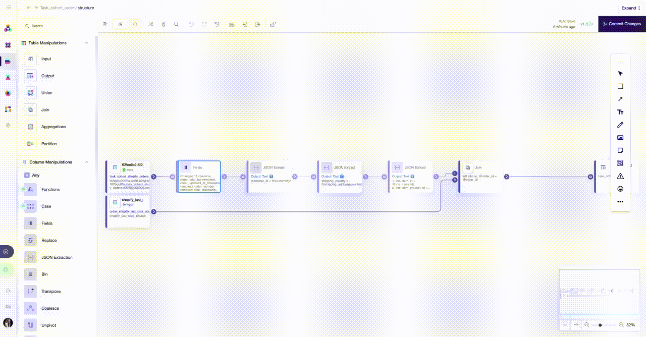
Start modeling
With your data ready, it’s time to build the model. With Y42, it only takes a few simple clicks to unify your data and get some insightful analytics to share with your stakeholders. Depending on the use case and your schema, you’ll now define the data points (columns) needed in your final output table. You’ll use these for your visualization later on.
For example, if you’d like to create a cohort that visualizes the retention of customers who purchased in the same month, you’d need: customer_id for identifying individual customers, order_created_at specifying when the order was created, and order_id to be able to count the number of orders.
Using UI modeling, drag and drop different modeling nodes for operations such as unionizing or joining different tables or manipulating columns. Below is a useful list of nodes that will help you bring the data to the intended format and structure.
Useful modeling nodes:
- Input and output functions
- Fields function
- Unionizing multiple tables
- Joining multiple tables
- Date parser function
- Date formatter
- JSON extraction function
- Functions node
You can finalize your model by using the Output node and committing it so that you can move on to creating visualizations with the data.
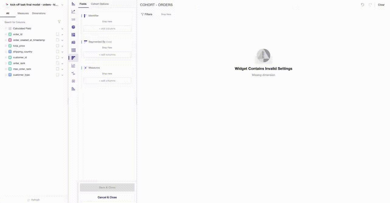
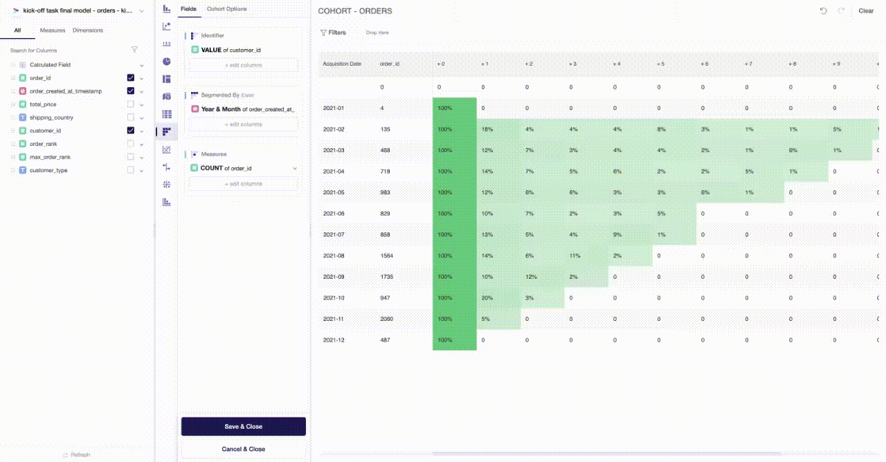
Creating your cohort table
Once you have all the data points required, you can start your visualization. This is where you can fully demonstrate the value of cohort analysis to your stakeholders. You can bring your data to life by simply selecting the dedicated cohort table widget in Y42 Visualize, and choosing the relevant metrics from the model you have just created. The three components you need to create a cohort table are:
- Identifier — unique trait to identify the customer (user_id)
- Segment By — a date column used to group unique customers into cohorts (purchase_date)
- Measures — a column identifying what the cohort analysis will measure (revenue or orders)
Don’t forget to apply conditional formatting and adjust cohort settings. The visual prompts can help you quickly identify the patterns and trends in behavior where, for example, a marketing campaign had a boost or where your product had a bug that caused users to leave.
Then, just click to save the widget and your cohort table is ready.
Interpreting your cohort table
The final step is to interpret your cohort analysis report for your stakeholders to ensure the information can support their decision-making. Cohort charts should be read left to right across the rows to give you an idea of a buyer’s behavior over their lifecycle, as well as down each column to understand your product or service’s performance over the selected period. With Y42, you have the unique option to apply a global filter to drill down on respective aspects of the data. For example, you can see how the cohorts who ordered your product in Germany are behaving, or how orders that are shipped to Switzerland are performing.
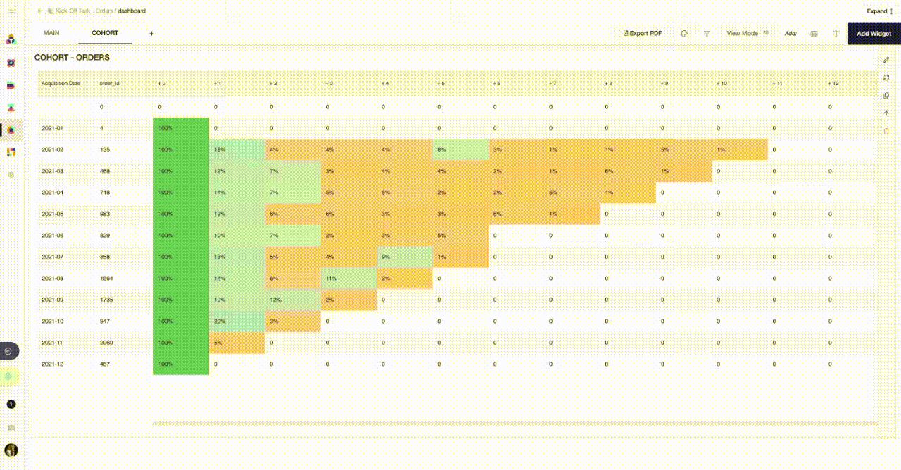
Now you can see, for example, the first month’s churn rate for respective cohorts or inspect which cohorts made a recurring purchase and when. As a next step, you can marry the cohort analysis with marketing cost data in order to analyze whether your customer lifetime revenue is in a healthy relationship to the marketing spend/customer acquisition cost.
Conclusion With cohort analysis, you can help your stakeholders better understand customer behavior by giving them the granularity they need to see what customers are doing and when. From here, it’s much easier for your customer support, product, or marketing teams to decipher why these behaviors are happening and act on the information.
Cohort analysis is an advantageous tool to have in your arsenal. It not only helps you to understand your customer retention (or whether you are retaining your customers at all and in what kind of rhythm they are coming back), but also how long it takes to generate enough revenue for you to break even. By utilizing the modeling and cohort features within Y42, you can run your cohort analysis faster and on a larger scale, without losing long hours on data integration and manipulation.
You’ll be providing valuable information and insight on customer behavior that your stakeholders can use to devise successful strategies to engage, convert, and retain customers.
Category
In this article
Share this article