
Do you struggle to powerfully communicate the insights behind your data? Is it a challenge getting the business to take action using the data at your disposal?
Data storytelling is the critical ‘last mile’ of communication that transforms your findings into actionable insights that will drive change and add value.
You might be great at collating and analyzing data, but if you don’t effectively channel this data into compelling and actionable communication, your data insights will go unnoticed. Done well, data-driven storytelling can transform your organization and create lasting change, resulting in a more responsive, agile, and business-resilient operation.
The power of data storytelling
Stories beat statistics in two ways: One, they are more memorable than statistics, and two, they are more persuasive. The human brain can be influenced to make decisions through both logic and emotion, so data alone won’t cut it — we need the story behind the numbers to be the bridge that connects our emotional side with our logical side.
“No one ever made a decision because of a number, they need a story,” Israeli-American psychologist and economist Daniel Kahneman famously said — and it’s true. Our brains expect and want a coherent story. It’s not enough to just provide insights; you need to craft an inspiring message that evokes action.
However, there is an art and science to data storytelling, and this starts with three pillars: narrative, data, and visuals. Combining data with a narrative helps you explain the insights in a way that’s easy to understand and remember. Data visualization brings the data to life and helps people see the trends and patterns that are often missed when just looking at rows and columns of figures.
But how do you actually ‘do’ data storytelling and where should you start? Read on for our top considerations for doing data storytelling well.
How to do data storytelling well
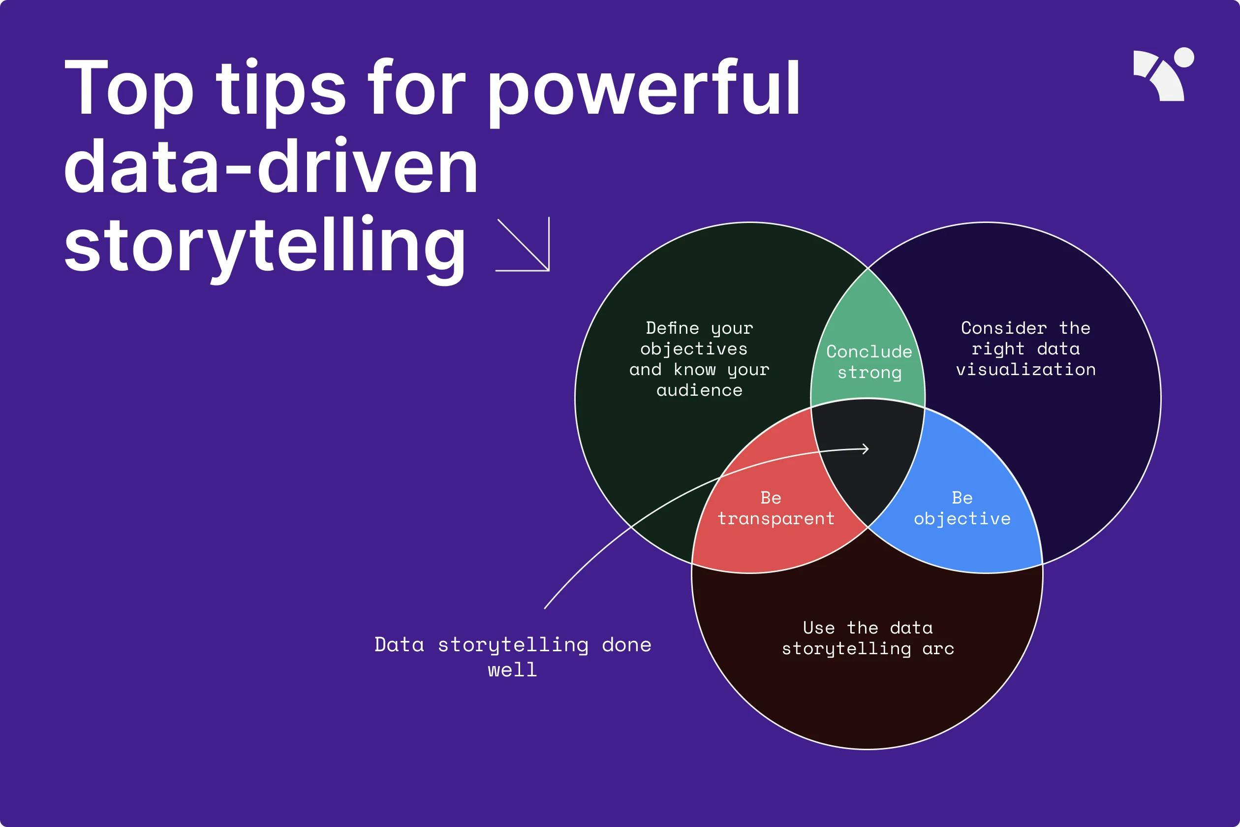
Define your objectives and know your audience
Before crafting your story, you need to understand who your audience is and what the goal of your data storytelling is. Who are you presenting the story to and what kind of metrics are important to them? Is it a specific team within your company or the board of directors? The kinds of things the senior management and other business influencers need to know will differ from what your own team or manager will want to hear. You may need to tell different stories from the same set of data, depending on your audience.
Think about what your different audiences will want to know and how they will want this presented to them. For example, if you’re talking to the finance team, ROI and cost-saving metrics will be more relevant, so shape your data insights around them. If you’re presenting to your sales and marketing colleagues, the most important KPIs for them might be MQLs, SQLs, opportunities, and cost per lead.
Tailoring your data sharing to your audience will help influence the message you convey and how you share it.
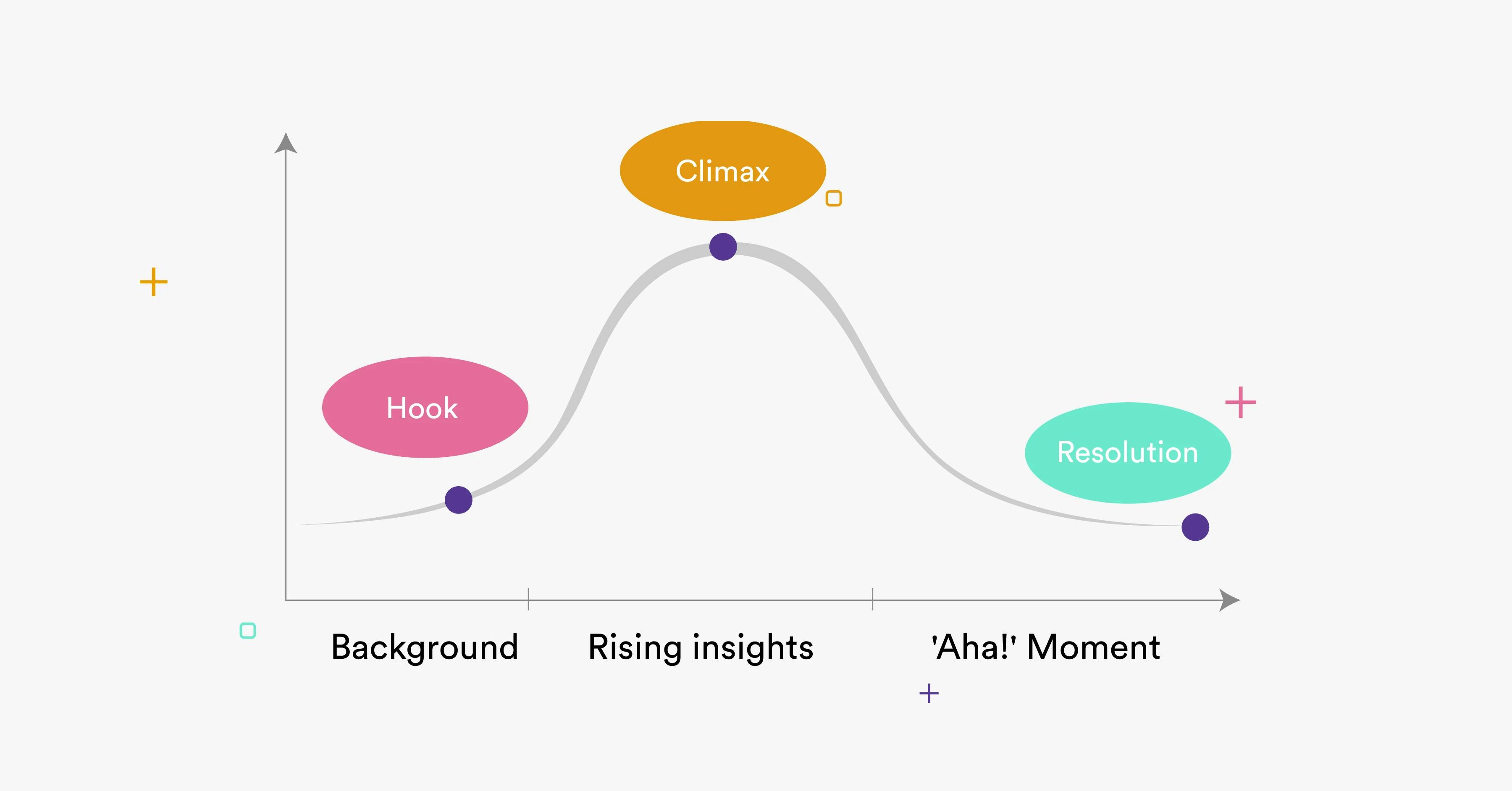
Use the data storytelling arc
A good story is always carefully structured, and data storytelling is no different. The narrative you want to communicate can be thought through using the following storytelling arc. Essentially, you start by setting the scene, creating a hook to capture your audience’s attention, contextualizing the business problem, and building up the tension to the big reveal — the key piece of data or insight you want to share and the action you want the audience to take:
- Set-up & hook — this is where you provide business context and background. For example, when presenting the marketing team’s quarterly performance, your context and background would be what happened in the previous quarter and what the team is looking to achieve, change, or discover in this quarter.
- Rising insights — these are the supporting details that reveal deeper insights into the problem or opportunity. It’s a bit like when you peel an onion — you reveal more layers. This is where you’d dive deeper into the marketing data to reveal any challenges or key discoveries, and provide the details of the channels you tested, the campaigns you ran, and how many leads they generated.
- ‘Aha!’ moment — the major finding or central insight. This is essentially the key thing you want your audience to remember, and the action you recommend they take. Carrying on with the marketing example, this might be the fact you have realized Google search isn’t working for the team when it comes to generating leads, so you’re recommending not putting so much budget into Google campaigns and trying out Twitter ads instead due to the campaign results there.
Consider the right data visualization
As the data storyteller, your job is to make it as easy as possible for people to consume the data you’re sharing without fatiguing them with too many stats. Illustrate your narrative with data visuals that can quickly provide the insights your audience wants, enhancing your storytelling and making your data more compelling.
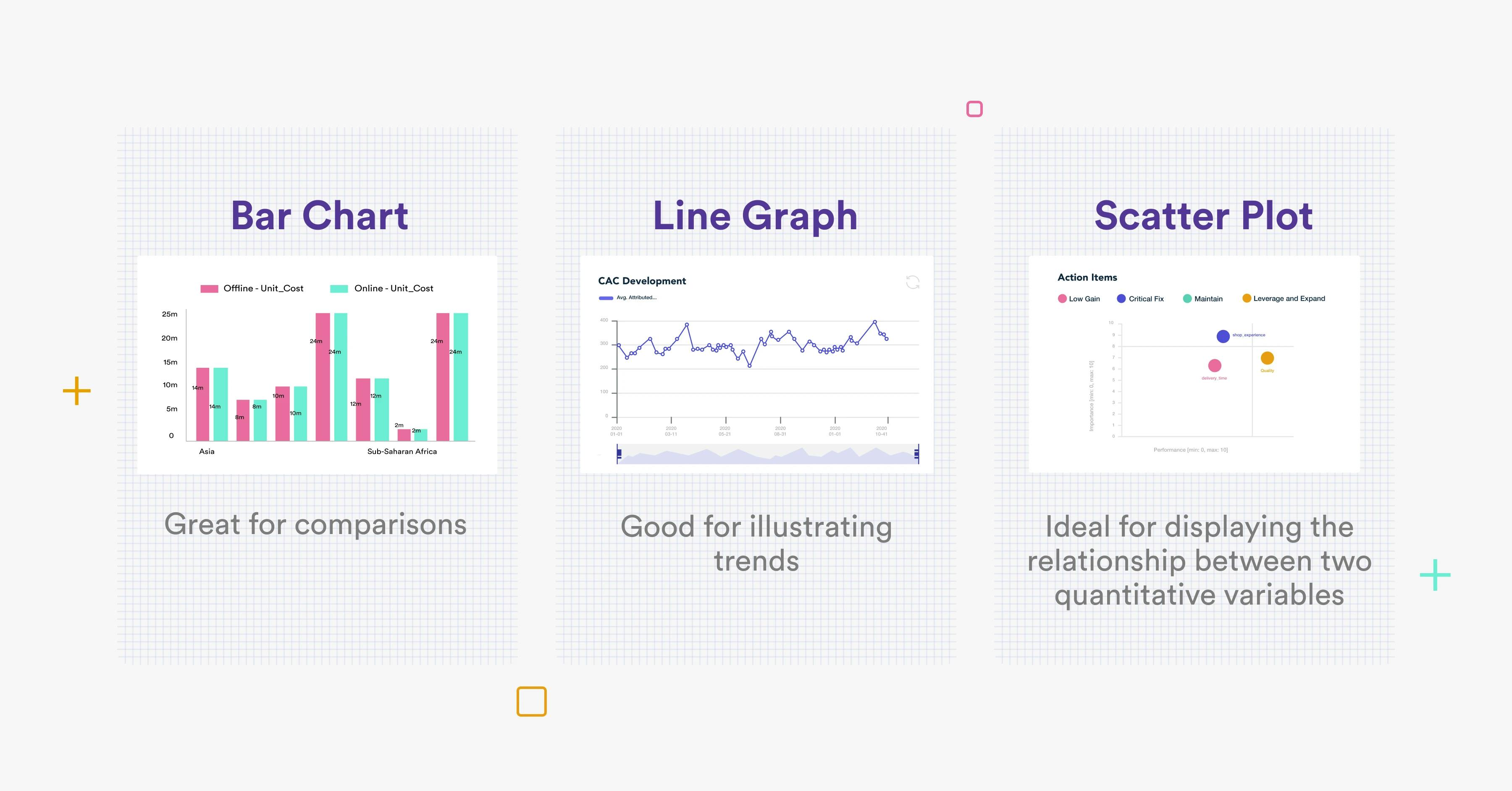
Be sure to choose formats that are easy to digest and follow, that don’t need much explanation. Let the visuals do the talking. That way, your ‘aha!’ moments will be more impactful and memorable. You should also think about the right type of data visualizations to use to display different types of information. Bar charts are great for comparisons, while line graphs are better for showing trends. Likewise, scatter plots are ideal for displaying the relationship between two quantitative variables such as ad spend and revenue.
Be objective and transparent
Your data storytelling should present the facts in an unbiased way, even if you’re using the data to support a specific point of view. Never draw conclusions that go beyond the data and always support your claims with the insights the data shows. Stretching the facts or adding interpretation — intentionally or unintentionally — can diminish your findings and reduce the audience’s trust in your information.
For example, let’s say the marketing team saw a 30% increase in leads from one month to the next, then a decline of 30%. You know the team tested a campaign on a new channel during the month of the increase, so a possible objective reason for the subsequent decline would be that they stopped running ads on that new channel. However, adding your own thoughts — for instance, that outside macroeconomic events such as war, inflation, or high unemployment levels have had an impact — would be stretching the facts and viewed as added interpretation.
Support your claims with the insights the data shows and avoid sweeping generalizations. Remember, the goal of your data storytelling is to inspire change, action, or transformation based on real data.
Wrap up with a strong conclusion and call to action
When sharing your data insights with the team, don’t forget to end your story by sharing potential actions and recommendations. Link back to the objectives you defined at the start of your data storytelling and share your suggestions for what actions could be taken as a result of your findings. If there isn’t a clear outcome and it requires further dialogue and discussion, make that the conclusion of your presentation. Your data storytelling could be the catalyst that sparks an important conversation between key decision-makers within your organization, inspiring them to take action or consider important and lasting change.
Data storytelling done well
Combining the right data with the right narrative and visuals creates a powerful story that could change attitudes and behaviors within your business, inspiring and motivating team members to make data-driven decisions and test new business hypotheses. What’s more, data storytelling is an essential skill in today’s data-driven economy, and one that can truly drive lasting business transformation.
Category
In this article
Share this article