
Color is a powerful tool for data visualizations. Used well, it can help communicate key findings; used poorly, it can distract from the insights you want the data to communicate.
Essentially, color imparts meaning to data visualizations. Using color strategically can draw attention to key metrics, helping the viewer readily absorb the information put before them. Misusing color, however, can slow down or distort the viewer’s analysis of the data.
Typically, the brain is hardwired to recognize and interpret patterns and anomalies in data when it’s presented in clear visualizations instead of tabular displays. As a creator of visualizations, your job is to find the right balance of visual attributes to make the data easier to process.
This is called visual encoding — the practice of assigning visual attributes, such as color and shape, to different types of data, which helps your audience translate data through a type of visual shorthand that the brain can easily decipher.
As data practitioners, understanding the role color plays in visual perception allows you to make more informed decisions when designing visualizations. Applying color in your visualizations successfully can make a world of difference in how decision-makers perceive the value of the data they’re being presented, and what actions they take based on that information.
So, how can you use and apply color in data visualizations for optimum success? Here are some rules and tips that will have you making intelligent and informed color choices in all your future designs.
8 rules for using color in data visualization
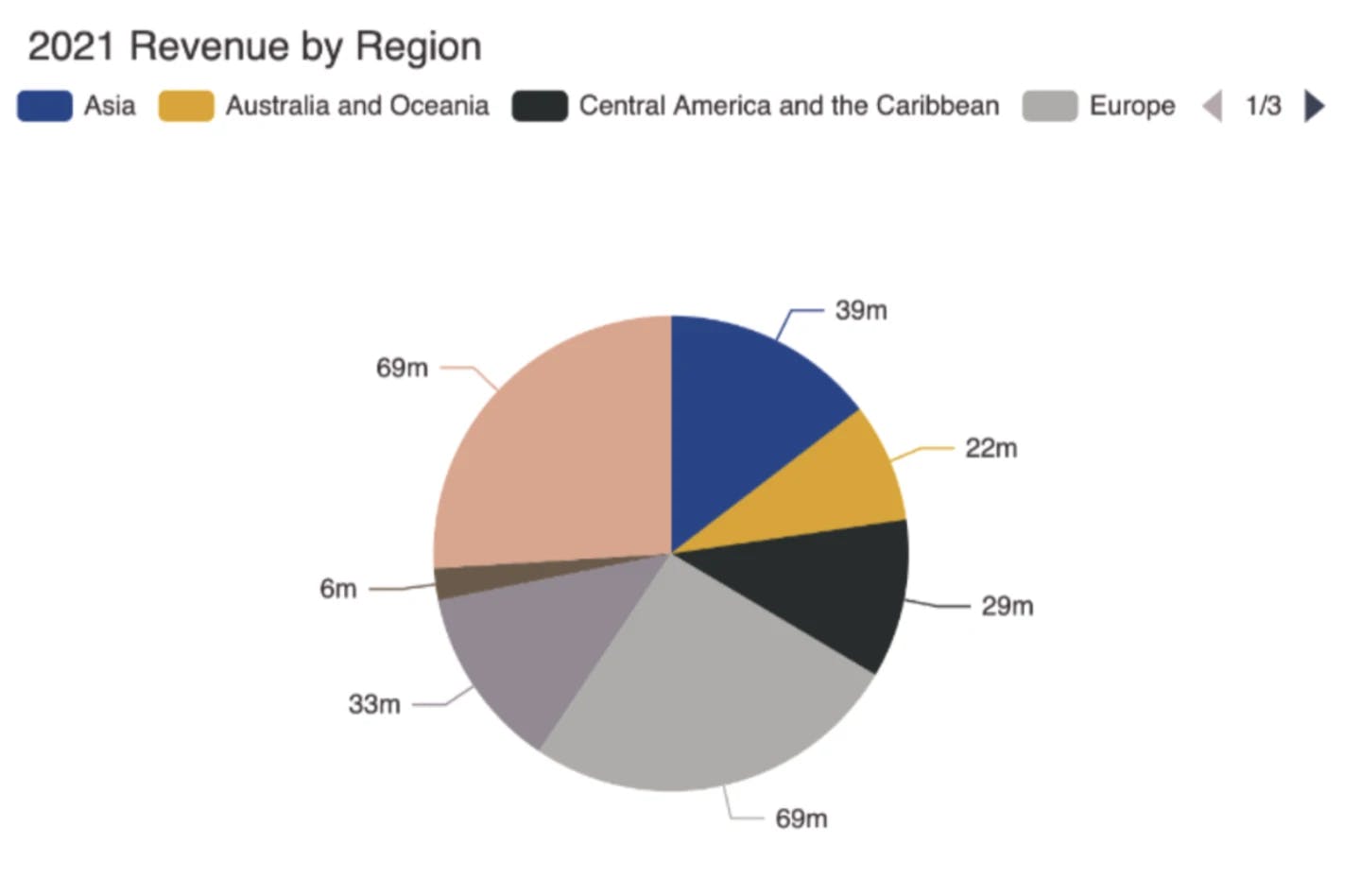
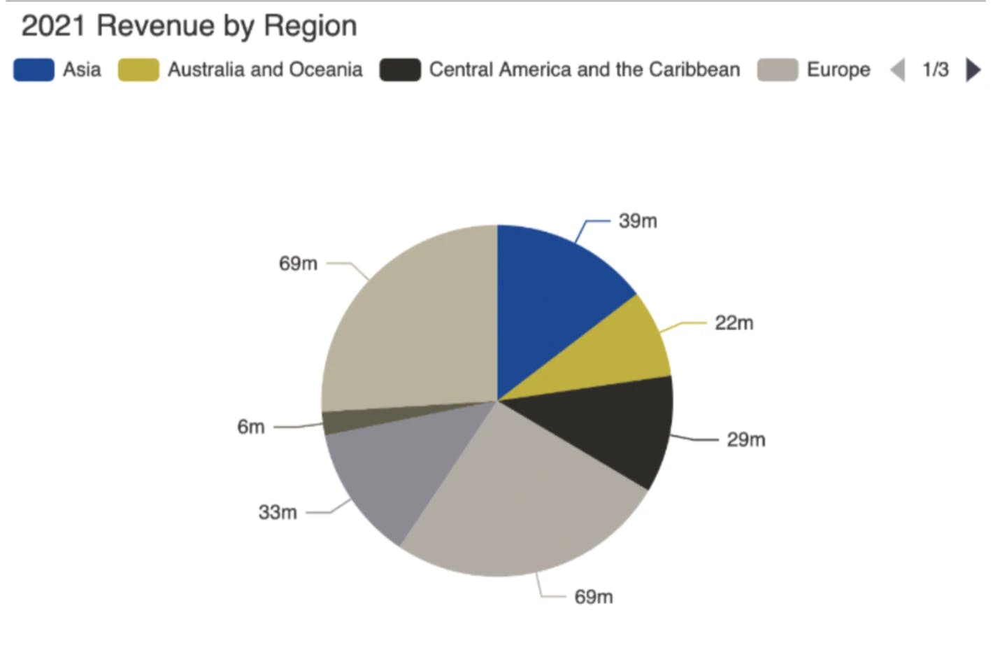
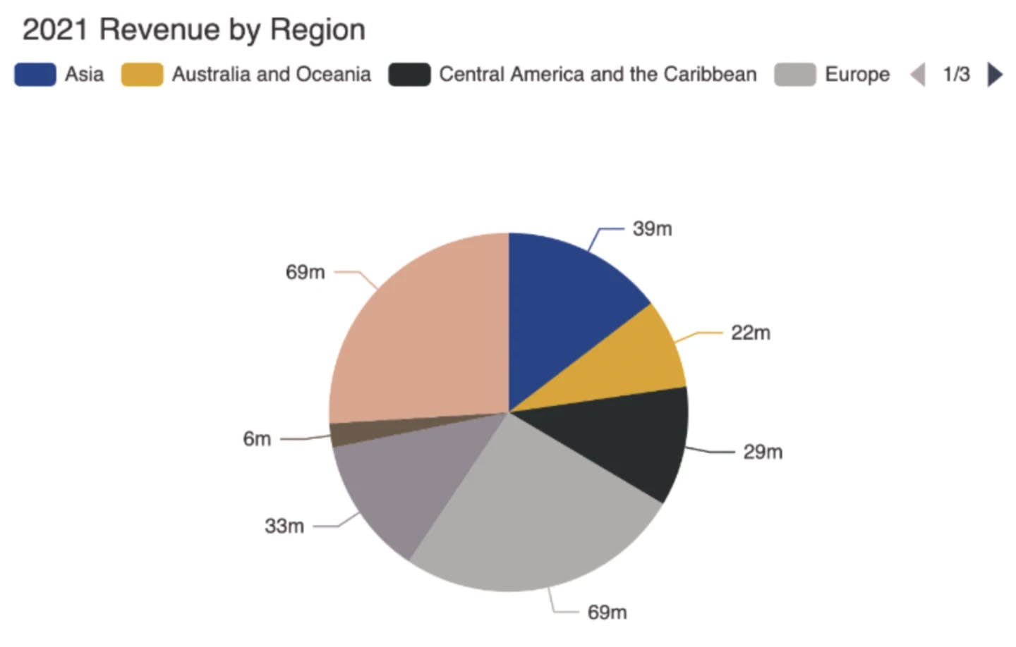
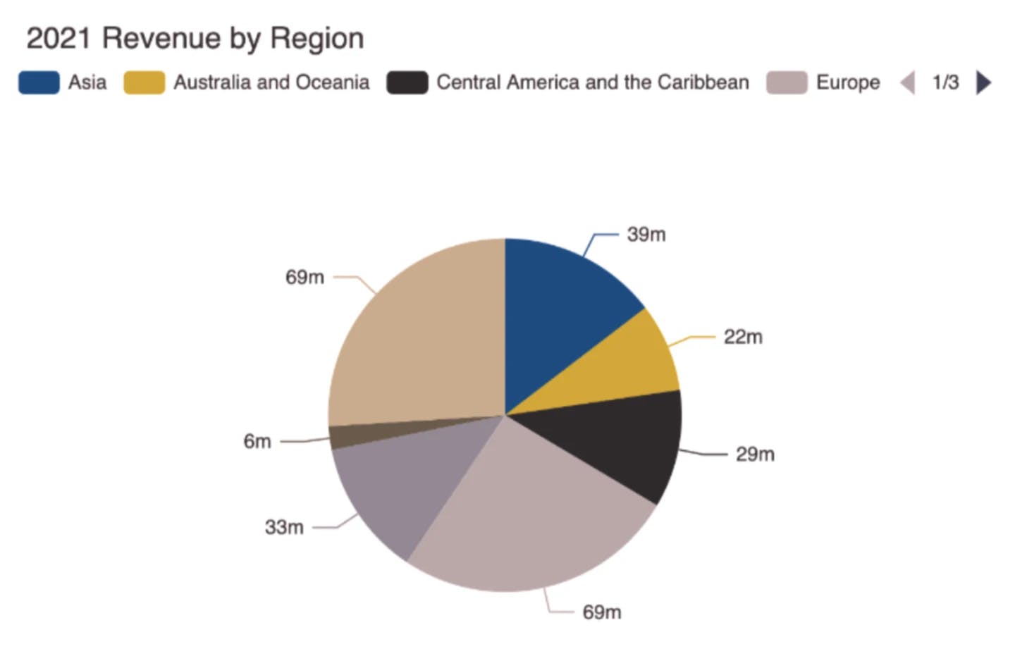
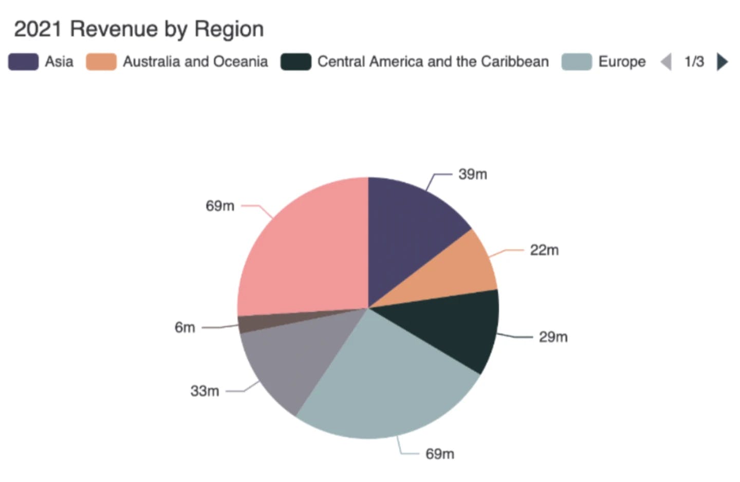
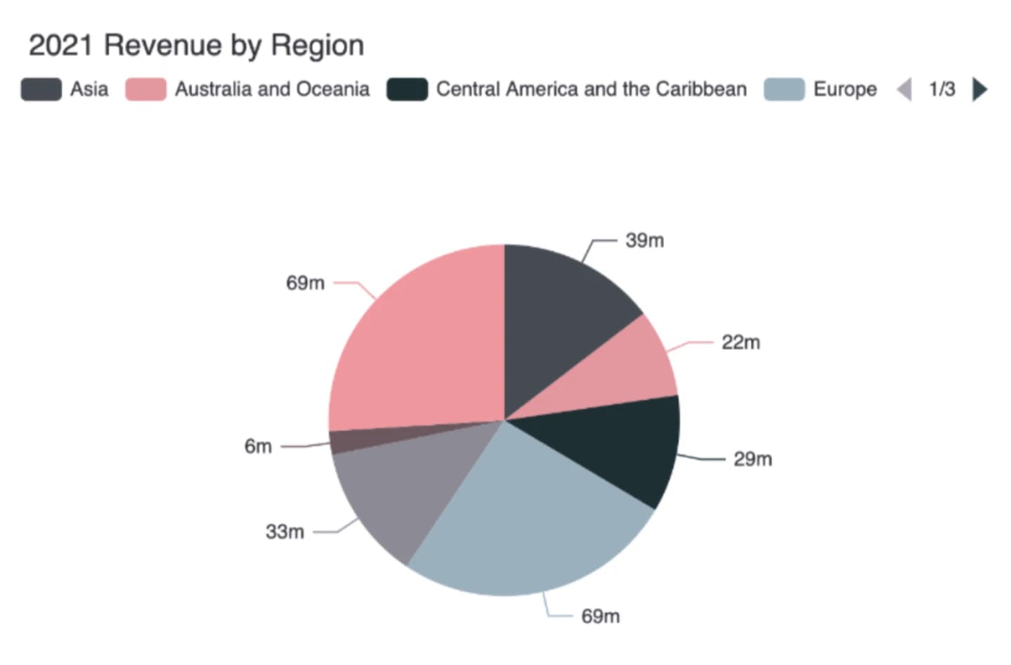
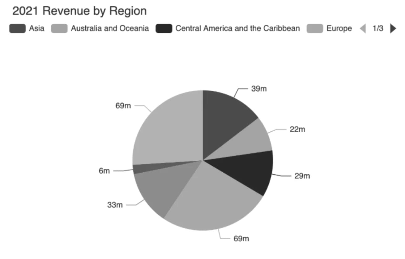
1. Avoid unnecessary use or overuse of color
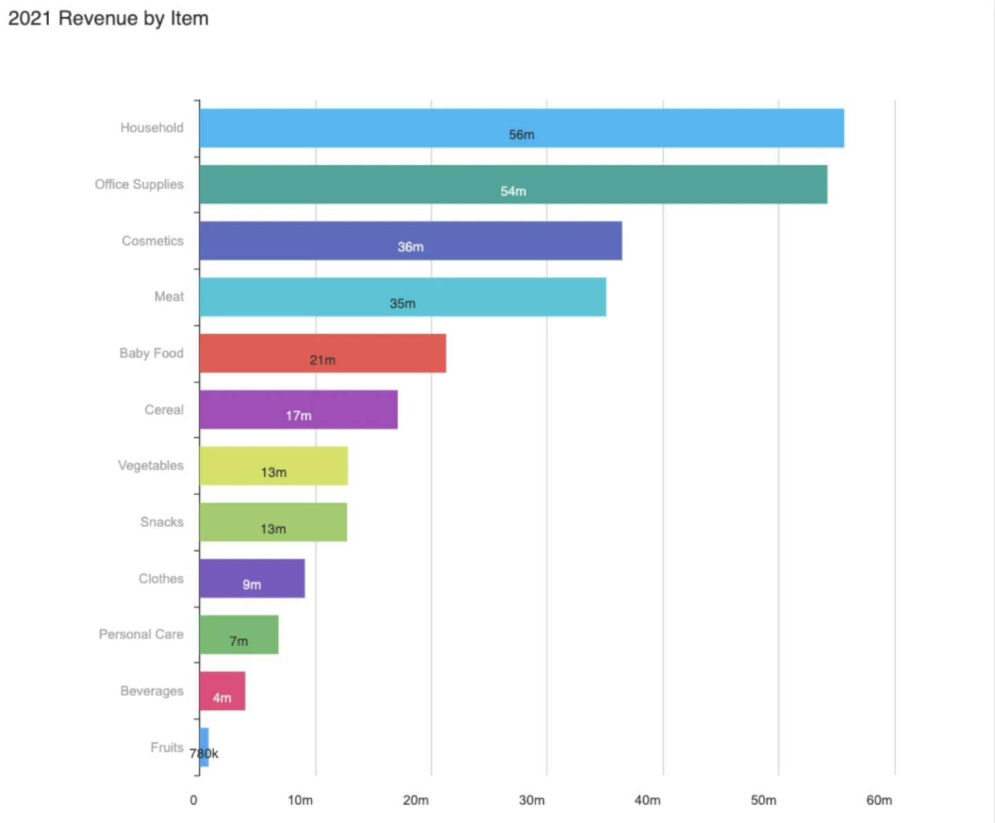
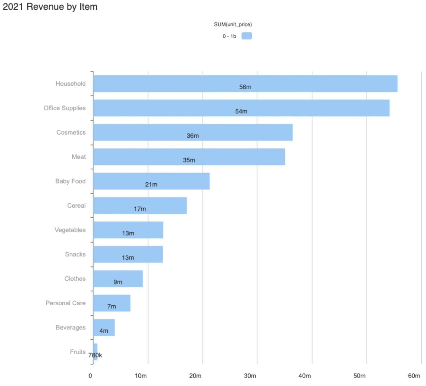
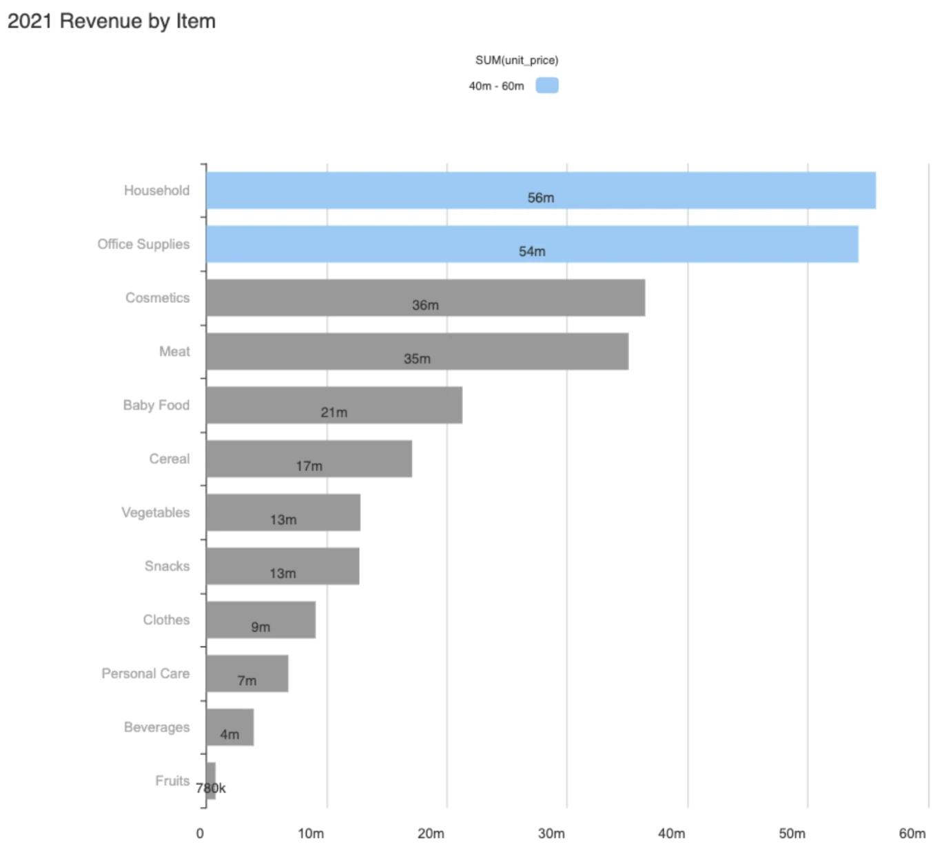
Using one or two colors has more of an impact than peppering your charts with every color of the rainbow. Using fewer colors enables the brain to process the information more clearly and means your audience is more likely to remember the key data points. In fact, a good rule of thumb is to use neutral colors like gray for the majority of your charts, reserving bright colors only for the data points you want to direct your audience’s attention to or where you want a comparison made. Research from Xerox shows information can be located 70% faster if it’s in color — so use it wisely and assign it to the information you want to stand out.
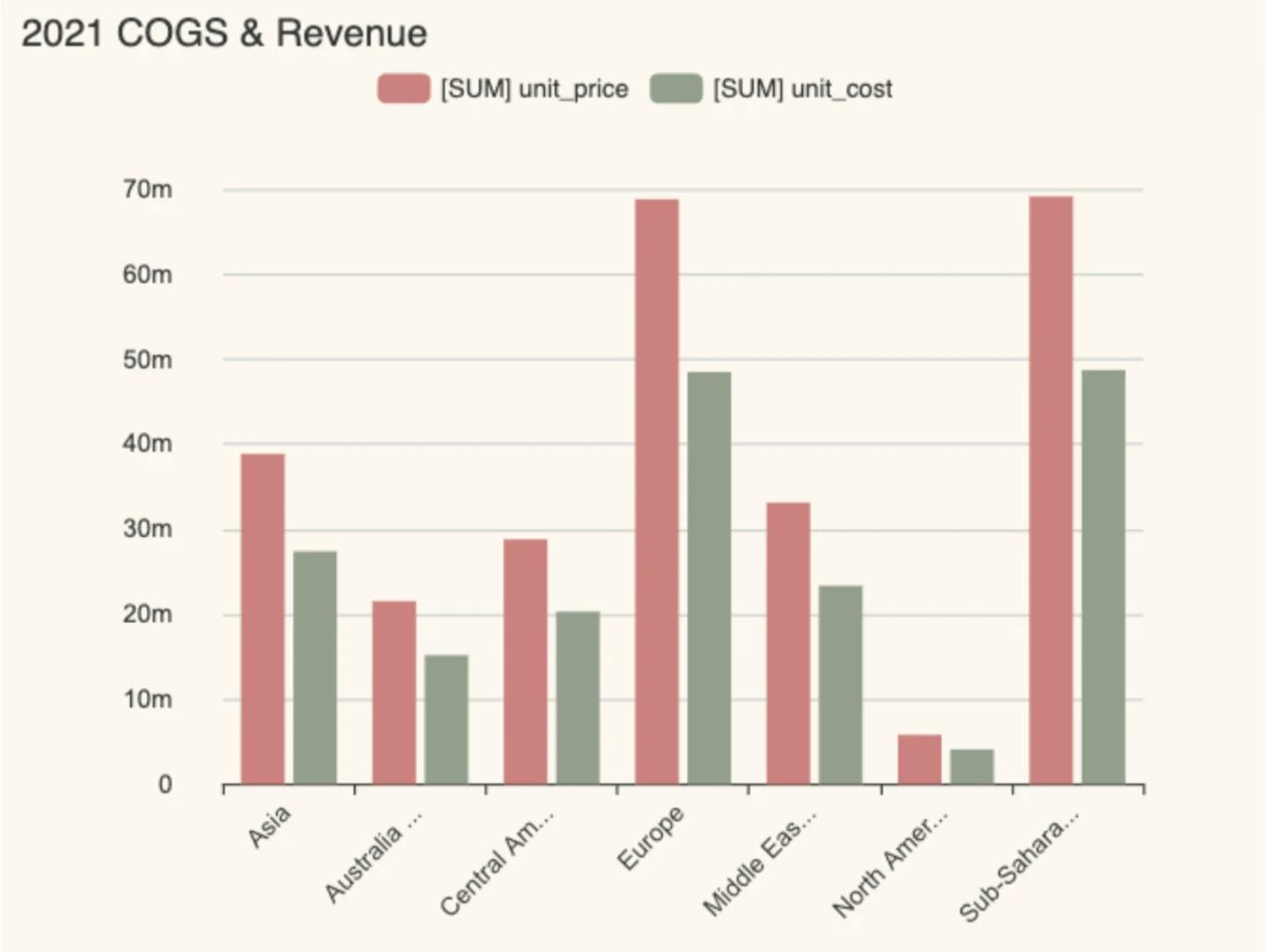
Bad use of color:
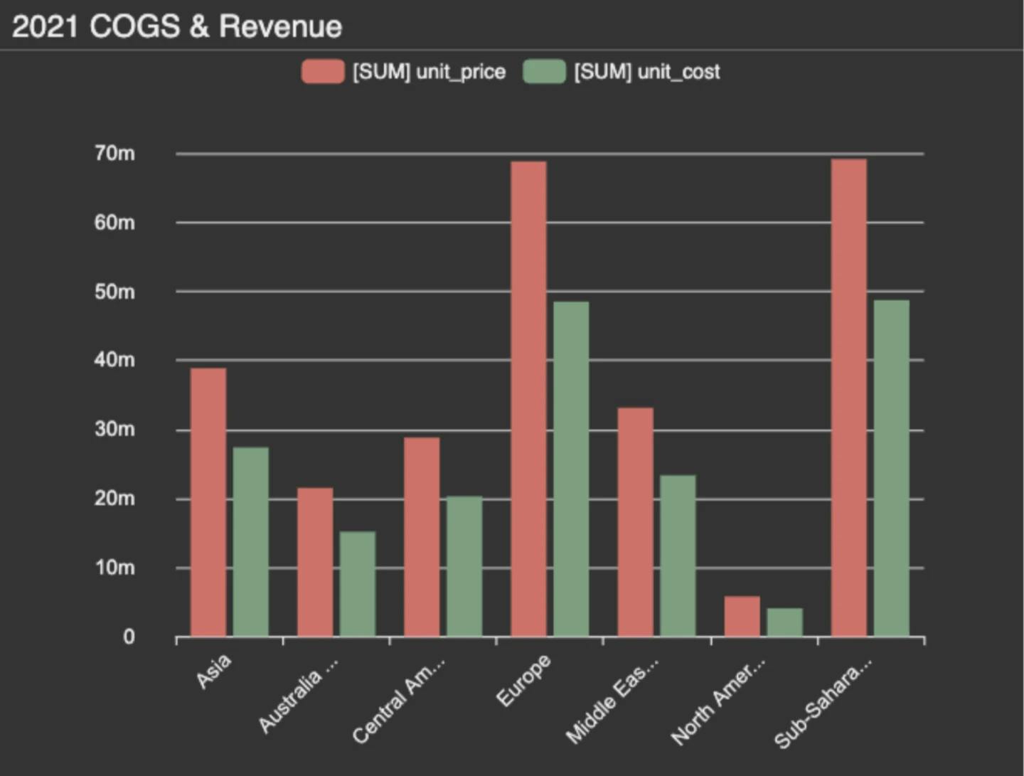
Good use of color:
The best use of color:
2. Stick to a theme and be aware of brand colors
Keeping to the same theme or set of colors creates consistency and quicker association for viewers when seeing new charts.
Tying the theme to your company or client’s brand colors is also a smart move. People will be used to seeing presentations in the company’s colors and the charts will land more favorably with business leaders and employees. Be aware of the brand guidelines for use of color, particularly if designing data visualizations for a specific client. Most organizations will have recommendations for what colors can and can’t be used together and will have spent time and money on a team of people to devise those guidelines. Adhering to the brand’s own color guidelines will not only save you time but also save you from embarrassing faux pas if you — for example — mistakenly use a competitor’s brand colors or a color that is culturally inappropriate.
Likewise, be mindful that the brand’s color palette won’t necessarily have been designed with data visualizations in mind, so apply your own common sense when creating charts based on brand colors. You might only be able to use one or two of them to make the visualizations work.
Bad use of color:
Good use of color:
3. Map your dataset to the correct color palette
It’s important to establish what type of data you have before you start designing your visualizations. This is so that you can use the most appropriate color palette for your dataset. There are three main types of color palettes used in the world of data visualizations:
- Qualitative palette — each color is distinct from the others
- Sequential palette — a single color in a variety of saturations or a gradient
- Diverging palette — color variables sit on a spectrum, such as cold to hot
Qualitative — This type of palette is ideal for visualizations displaying categorical variables — those that are unrelated to one another and don’t have a numerical value. For example, if a company wanted to present the diversity of its workforce, you might create a visualization based on a set of qualitative data, like the ethnicity, age, and gender of its employees.
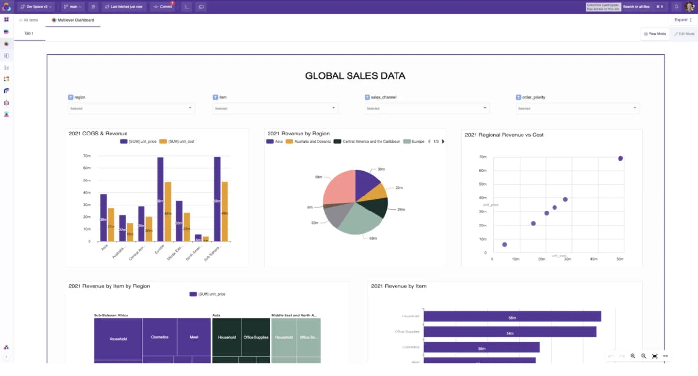
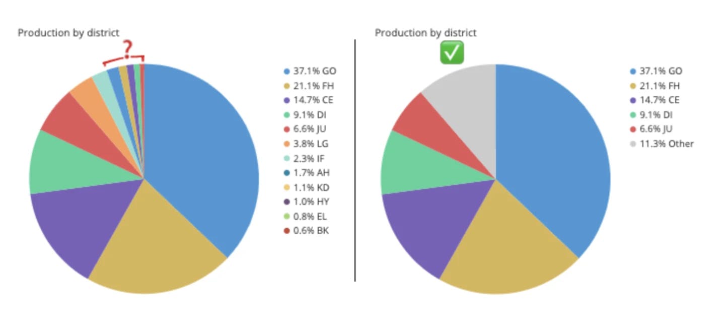
In a qualitative palette, the colors assigned to each category need to be distinct. You should also try to limit the maximum palette size to 10 colors or less. It becomes difficult to distinguish between categories when you reach more than ten colors. If you have more data categories than ten, consider grouping values together by putting the smallest categories into a single “other” category, for example.
Source: How to Choose Colors for Data Visualizations
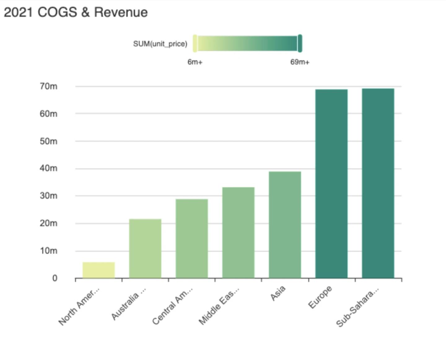
Sequential — This palette is suited for quantitative data that progresses from low to high values. Colors are assigned to data values in a continuum, usually based on lightness, hue, or both. Typically, light colors are used for low data values and dark colors for high data values. A sequential palette communicates information in ordered, numeric values, such as financial amounts over time. It is the ideal option for trend charts, helping you highlight the evolution of a certain parameter.
Don’t use sequential colors with categorical data. Sequential colors are optimized for numeric meaning. Using these colors for dimensions can undermine the numeric association and lead users to misunderstand visualizations. Ultimately, your sequential color palette should easily indicate the relative distance or gap between values and be uniform across the entire range.
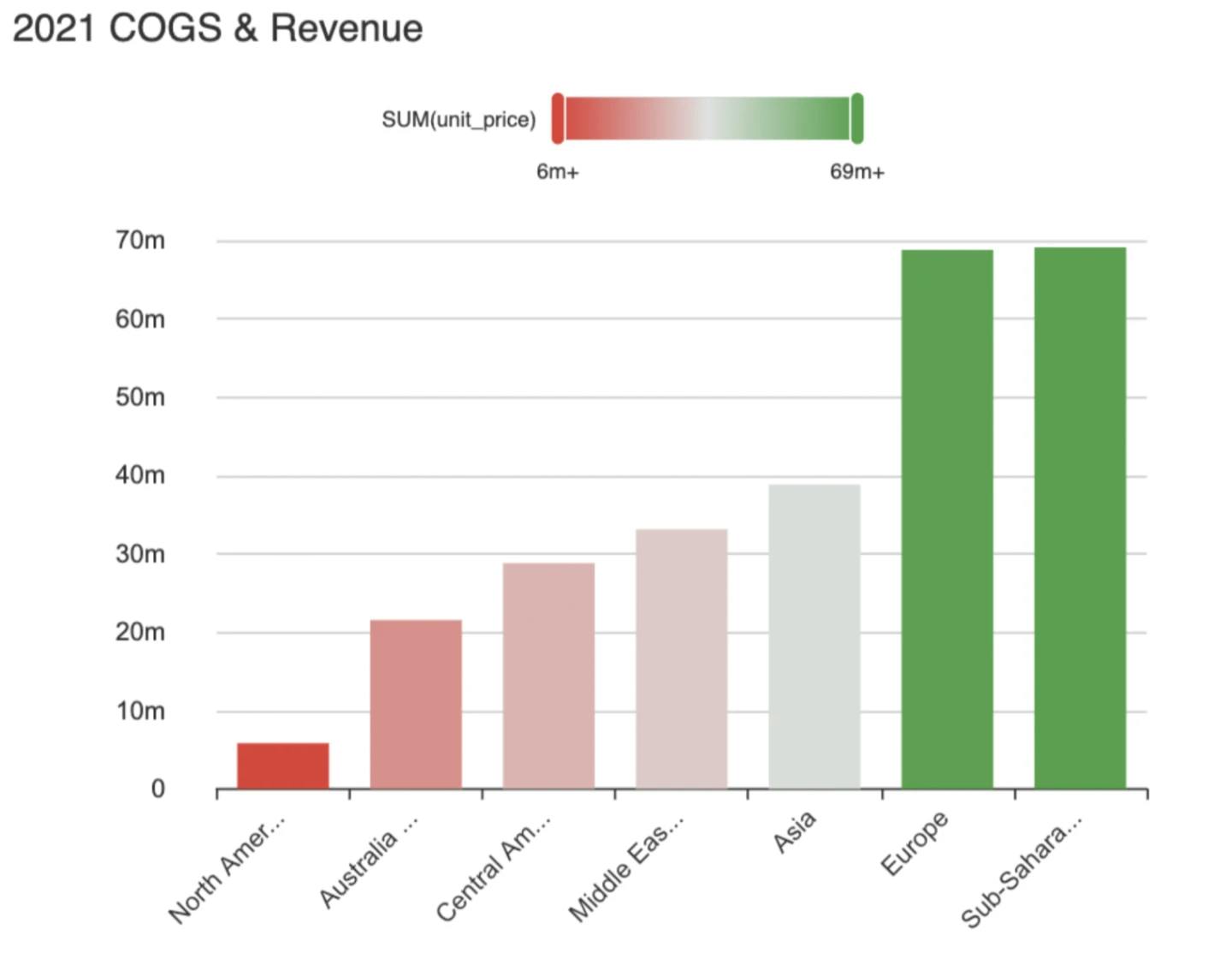
Diverging — Similar to sequential color palettes, diverging color palettes go from low to high but with a light or neutral middle value, which then goes darker towards both ends of the scale to help indicate a larger distance from the center. This type of color palette is ideal for highlighting extremes in the value range and is useful for variation analysis where both positive and negative values are possible, such as opinion poll responses.
As a general rule with diverging data charts, choose two hues —one communicating desirable values and the other representing undesirable values.
4. Be mindful of the interaction of colors
A color can change depending on the other colors surrounding it. For instance, if you use yellow surrounded by red, you’ll get a very different perception of that color than if you surround it with blue. This is known as the interaction of color and has been famously written about by Josef Albers in his now 50-year-old classic, the Interaction of Color.
Essentially, you want to aim to use colors that are easily distinguishable when placed next to each other in your data charts. Don’t make people squint at the screen because the colors are too faint or clash with each other. Consider your background colors too. A neutral background is often the default, but sometimes, a white or gray won’t work well for your particular data visualization. Or, people sometimes go for a bold background, but that might distract from the data you’re trying to present. Be mindful of the interaction of different colors and how they can change people’s perception of the data they’re viewing.
5. Respect color conventions
Colors can be perceived very differently around the world, with some colors symbolizing certain meanings for particular cultures and countries. For example, in Western countries, red can be seen as a warning, but it also evokes excitement, urgency, and love. When red is combined with green, the color scheme becomes festive — the traditional colors of Christmas. In India, red is associated with purity, with a bride traditionally wearing a red wedding dress, whereas in China, red symbolizes luck and happiness, and in the Middle East, red symbolizes danger and caution.
Again, your company or client’s brand guidelines should help guide you around the use of any cultural color conventions, but it won’t hurt to be mindful of your audience and do your own research around any specific culture or country-specific color meanings they might have.
6. Embrace color harmony
Color harmony is a technique of showing visualizations in the most meaningful, aesthetic, and simple way. It takes Isaac Newton’s color theory and the relationships between colors into consideration, and it also involves a touch of artistry.
At its heart, the concept of color harmony is based on the color wheel, which is a circular diagram of colors originally created by Newton. To really optimize your data visualizations, if you delve into the world of color harmony, you will start to understand the relationships between different colors in relation to their position on the color wheel. For example, blue is across from orange on the color wheel, so the two colors complement each other. Meanwhile, colors that are next to each other on the wheel are called analogous colors. You need to be mindful of how you use them in data charts, as they might not create the necessary distinctions in your data values.
To create color harmony in your charts, it is important to pay attention to the “temperatures” of colors. Cool colors are blue, green, and purple, while warm colors are red, yellow, and orange. When planning your data visualizations, think about the mood you want to set and the feelings you’d like to evoke. Cool colors are calm and watery, while warm colors are energetic and intense. Meanwhile, black, gray, and white are known as neutral colors.
7. Make your designs accessible to all
Approximately 4.5% of the world’s population has some form of color vision deficiency. The most common color blindness is red/green, followed by blue/yellow color blindness. Complete color blindness is quite rare. With this in mind, it’s important to ensure your color data visualizations can be viewed by all.
Luckily, there are some handy color-blind simulation tools out there that you can run your designs through to check they meet the key criteria for people with color vision deficiency. Coblis – Color Blind Simulator – is a particularly good one that’s free to use. Upload your design and it will tell you if there are any gaps where people won’t be able to see certain colors in your data charts.
Adobe Color also has a color blindness checker with recommendations on how you can solve your color conflict by moving your inaccessible color around the color wheel, making it accessible to everyone. Adobe also has a whole suite of tools to help you create visually accessible color themes.
For reference, here's a color blindness chart:
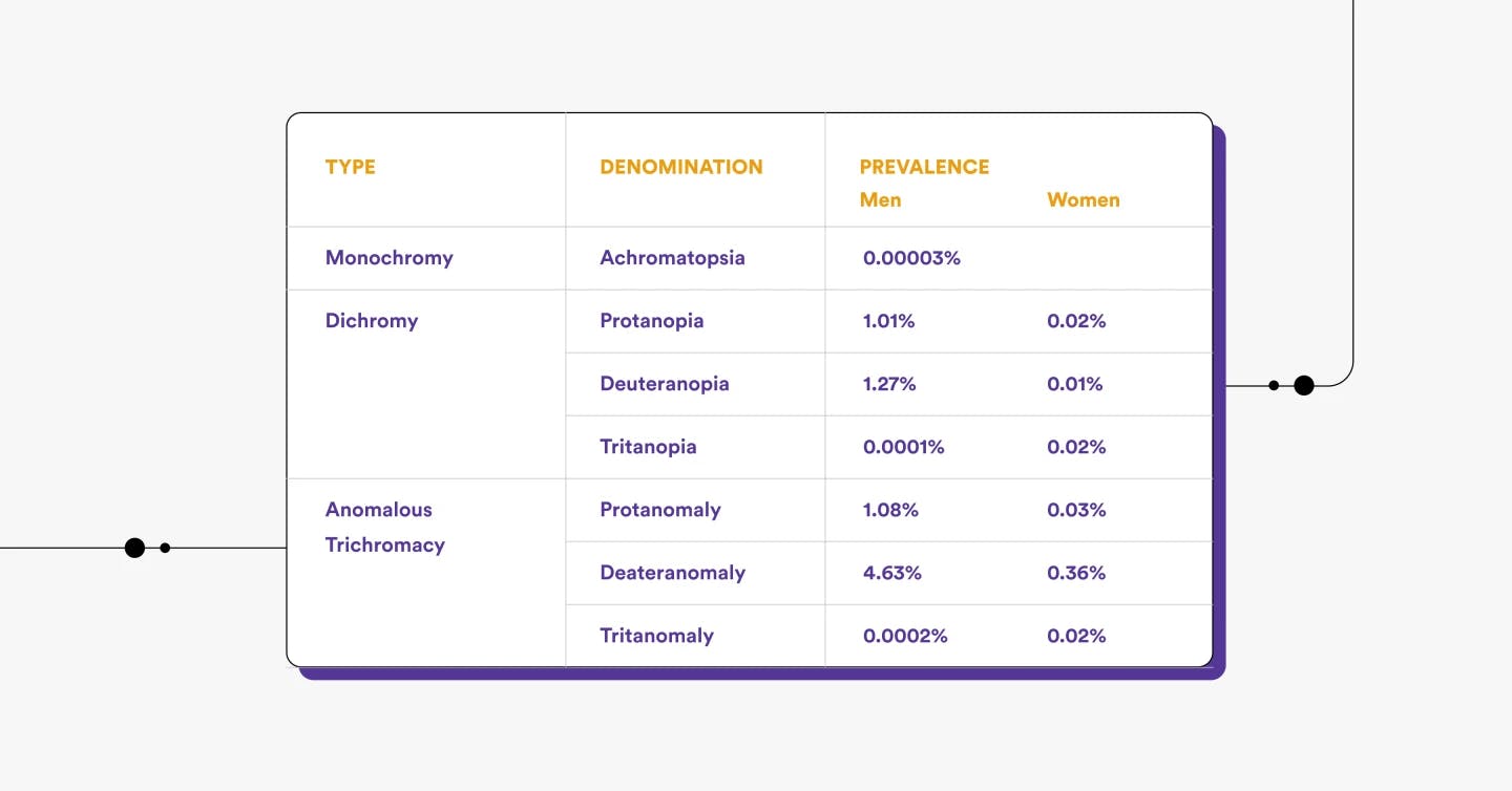
No color blindness:
Red-weak (protanomaly) - 1.08% of men, 0.03% of women:
Red-blind (protanopia) - 1.01% of men, 0.02% of women:
Green-weak (deuteranomaly) - 4.63% of men, 0.36% of women:
Green-blind (deuteranopia) - 1.27% of men, 0.01% of women:
Blue-weak (tritanomaly) - 0.0002% of men:
Blue-blind (tritanopia) - 0.0001% of men:
Monochromacy (achromatopsia) - 0.00003% of men:
8. Get it right in black and white
This might seem obvious, but our final rule is to get your design right in black and white first. Make sure your dataset works with your chosen visualization and start playing around with color once you’re happy. If it falls apart as you start to colorize it and you’re up against a deadline, then at least you’ll have a usable black-and-white version.
The more you experiment and try out the different color techniques, the more comfortable and familiar you’ll become with colorizing your data visualizations for maximum impact.
Get creative and don’t accept the status quo
Color is often lost as a tool for conscious choice. This is because of the automatic default settings within the various data visualization tools you might use. Deadlines mean you don’t always have the luxury of time to get creative and start changing the colors of your automated designs. But we hope our eight golden rules for using color effectively in data visualizations have inspired you to don your artist’s hat and be more experimental with color in your designs.
The smart application of color can not only bring your data visualizations to life, but it can also help disseminate key findings, add meaning to complex datasets, and help viewers absorb the information faster and draw conclusions that they might otherwise miss.
Category
In this article
Share this article